Beginner's Guide to Mixing Wood Tones in Furniture
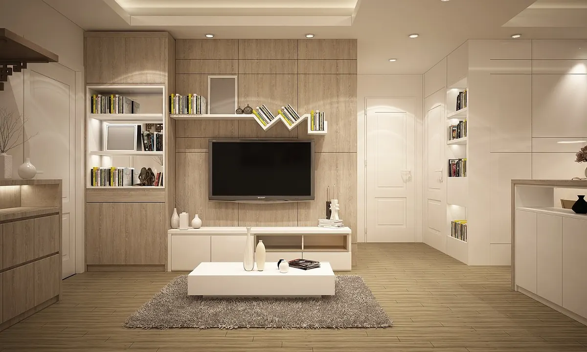
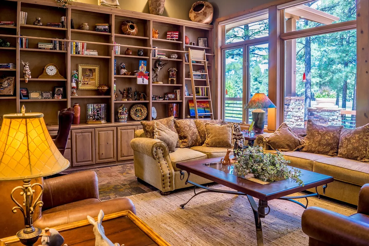
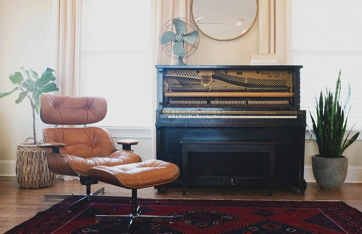
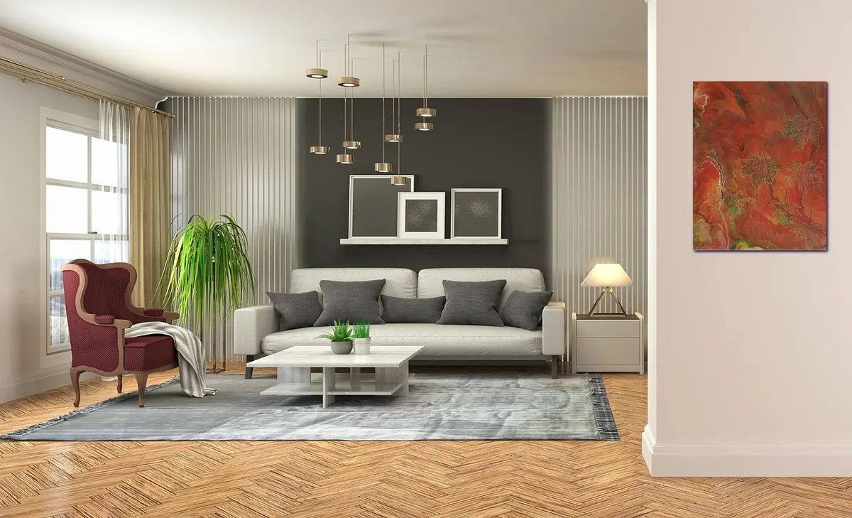
Matching furniture sets are not the only way to make a room feel finished. A room with an oak sideboard, a walnut coffee table, and pale ash chairs can look deliberate, layered, and far more interesting than a showroom suite. The trick is not to avoid mixing wood tones; it is to control them. Once you understand undertones, contrast, and repetition, mismatched pieces stop looking like leftovers and start looking collected. This guide gives you a practical way to choose, place, and edit wood furniture without turning your living room into a wood-grain sample board.
Read the Undertones Before You Shop
Wood color is only half the story. Two medium-brown tables can clash because one leans yellow and the other leans gray. The underlying cast is the undertone, and it decides whether pieces will sit comfortably together. Warm undertones tend toward yellow, orange, honey, or red. Cool undertones tend toward gray, ash, taupe, or a greenish-brown. Neutral woods sit somewhere in between and are often the easiest to mix.
Species names help, but they are not a guarantee. Oak can be golden or fumed gray. Walnut can read chocolate-warm or cool and almost black. Cherry deepens with age, while pine often carries a yellow-orange glow. Finish matters too: a clear oil finish keeps wood lively, while a heavy stain can push it toward another color family. Always judge the actual piece, not the label on the showroom tag.
The white-paper test
Put a small sample or an inconspicuous part of the furniture against a plain white sheet of paper in daylight. Look at the wood, not the paper. Ask yourself whether it looks more yellow, red, gray, or neutral. Then place the sample next to your floor and next to the piece it will live near. Flooring is the largest wood surface in most rooms, so it sets the baseline. If your floor is warm golden oak, a cool gray-ash table can be a sharp contrast; it can work, but it needs repetition elsewhere.
Choose a Contrast Level on Purpose
Contrast is the difference in lightness and undertone between pieces. You can go low, medium, or high, but the result should look like a decision rather than an accident. Low contrast is calm and easy: honey oak, warm ash, and lighter walnut in similar values. Medium contrast gives a room some movement without shouting. High contrast is dramatic: nearly black walnut beside pale ash or bleached oak. High contrast is not wrong, but it needs a bridge and a repeat so the darkest piece does not look stranded.
Three useful contrast levels
- Low contrast: pair mid-tone oak with ash or a pale walnut; keep finishes similar and let shape do the talking.
- Medium contrast: place a warm cherry side table with a cooler walnut console; repeat each tone once more in frames, stools, or a tray.
- High contrast: use a dark walnut dining table with pale oak chairs; add a rug or bench that includes both tones so the jump feels intentional.
Look at value first, then undertone. A room with all mid-brown wood can feel flat even if the undertones differ slightly. A room with one very dark piece and several pale ones needs a third note, such as a medium walnut bowl or a pair of dark wood candleholders, to connect the extremes.
Repeat Tones to Build a Rhythm
Repetition is the quiet workhorse of a mixed-wood room. If you use a tone once, it can look like a mistake; use it twice or three times, and it reads as a theme. You do not need to buy more furniture. Repeat a wood tone in a picture frame, a lamp base, a bowl, a small stool, a tray, or the legs of an upholstered chair. The repeats can be small, but they should be visible from the main seating area.
Think in terms of a dominant wood, a secondary wood, and an accent wood. The dominant tone appears most often and often matches or relates to the floor. The secondary tone supports it on larger pieces. The accent tone is the dark or light piece that adds punch. If your dominant is warm oak and your secondary is medium walnut, a pale ash chair is the accent. Echo that pale ash once in a frame or side table, and the room settles.
Where to repeat a tone without buying furniture
- Photo frames and mirror frames
- Bowls, trays, and bookends
- Lamp bases and shade finials
- Small stools, side tables, or plant stands
- Cutting boards displayed in a kitchen, or a wooden clock in a hallway
Finish is part of repetition, too. A matte oak table and a glossy oak cabinet share a tone but not a mood. That can be a good contrast, especially in a room that needs a little polish. Just make sure the glossy piece does not become the only shiny object in a sea of matte wood unless that is the point.
Use a Bridge Piece to Soften the Jump
A bridge piece contains both tones or sits between them in value. It might be a chair with a walnut frame and an oak seat, a table with a dark top and pale legs, or a weathered bench that reads as gray-brown. A rug with warm and cool browns can do the same job on the floor. Bridges are especially useful when you love a high-contrast pair but do not want the room to feel chopped in two.
If you do not have a literal two-tone piece, use placement as a bridge. Put the medium-tone piece between the dark and light ones. In a living room, that might mean a walnut console between a pale oak sofa frame and a dark coffee table. The eye travels from light to medium to dark instead of jumping across the room. The same idea works in a bedroom: place a mid-tone cedar chest at the foot of a pale bed and near a dark walnut dresser.
Balance Scale, Finish, and Placement
A small dark side table beside a huge pale dresser can look like an afterthought, even if the tones are repeated elsewhere. Scale matters as much as color. If one piece is visually heavy, give it company. A dark coffee table can hold its own with a dark floor lamp or a dark wood bowl. A delicate pale chair may need a second pale element nearby so it does not disappear.
Spread tones around the room rather than clustering them against one wall. Imagine a triangle from the main seating area: one wood tone on the left, another on the right, and a third in the middle distance. This keeps the mix balanced and stops one corner from looking like a furniture clearance section. The floor, the largest wood surface, should relate to at least one piece in the room. If the floor is cool gray, a warm cherry piece can be a welcome contrast, but repeat that warmth in a frame or tray.
A five-minute arrangement check
- Stand at the main doorway and squint. Note which wood tone dominates and whether any piece looks isolated.
- Check the floor against the nearest furniture. If they fight, add a rug or a mid-tone piece between them.
- Look for one repeat of each tone. If a tone appears only once, add a small accessory in that tone or move the piece closer to a similar one.
- Check the finish mix. If everything is glossy, add a matte wood tray; if everything is matte, let one polished piece stand out.
The Final Edit
Good mixing is mostly editing. Choose a dominant wood tone, decide how much contrast you want, and repeat each tone at least once in a way that can be seen from the sofa. If a piece still feels wrong, do not rush to replace it. Try moving it, adding a bridge piece, or bringing in a small accessory that repeats its tone. Sometimes the fix is a walnut bowl, not a new table.
Before you buy another piece, take a photo of the room in daylight and check it on your phone. The camera often reveals a tone that looks neutral in person but reads orange or gray on screen. Trust that information, but make the final call in the room. A collected room should feel layered, not labored. When in doubt, remove one wood piece and see whether the room breathes. The goal is not perfect matching; it is a mix that looks like you meant it.
Photo: newhouse / Pixabay